Johnson & Johnson
Designing a seamless online ordering and planning platform for custom surgical implants
ROLE
SKILLS
TEAM
TIMELINE
CONTEXT
As the Creative Project Manager, I was tasked with leading the user experience design of an online ordering platform for custom surgical implants.
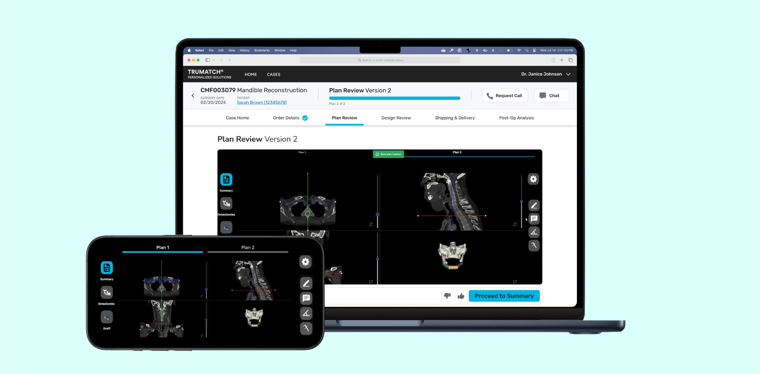
DePuy Synthes, a part of Johnson & Johnson MedTech, specializes in providing comprehensive orthopedic and neurological solutions. TRUMATCH Solutions, a platform developed by DePuy Synthes, is designed to streamline the process for surgeons, enabling them to upload and review patient scans and order custom implants.
When I was introduced to the project, some features of the platform were already built but needed refinement in terms of elevating the user experience and visual design. My task was to redesign these existing features, introduce new ones, and ensure design consistency throughout the platform. This case study details the comprehensive UX design process, from exploring the problem space to implementing a robust design system for DePuy Synthes TRUMATCH Solutions.
PROJECT PLANNING
We worked with the development team to create a project timeline that aligned with their agile framework.
We worked with the rest of the design team, as well as our product, development, and business stakeholders, to devise a project timeline and align with the development team’s agile framework, which involved 3-week sprint cycles. Learning how to use Jira to track the development team's sprint schedule was essential for effective planning and alignment with them.
.png)
UNCOVERING NEEDS
Before starting our design sprints, we used a variety of UX research methods to gain insights into user needs.
Journey Mapping
To understand the full surgeon workflow for completing a CMF (Craniomaxillofacial) case, we created a comprehensive journey map. This map highlighted the "moments that matter" most in the journey, helping us identify the critical points to focus on.
.png)
Competitive Analysis
We conducted a competitive analysis to understand what other products in the market were offering. We discovered that many existing solutions were outdated in terms of UX trends, which provided an opportunity to innovate and improve the user experience significantly.
.png)
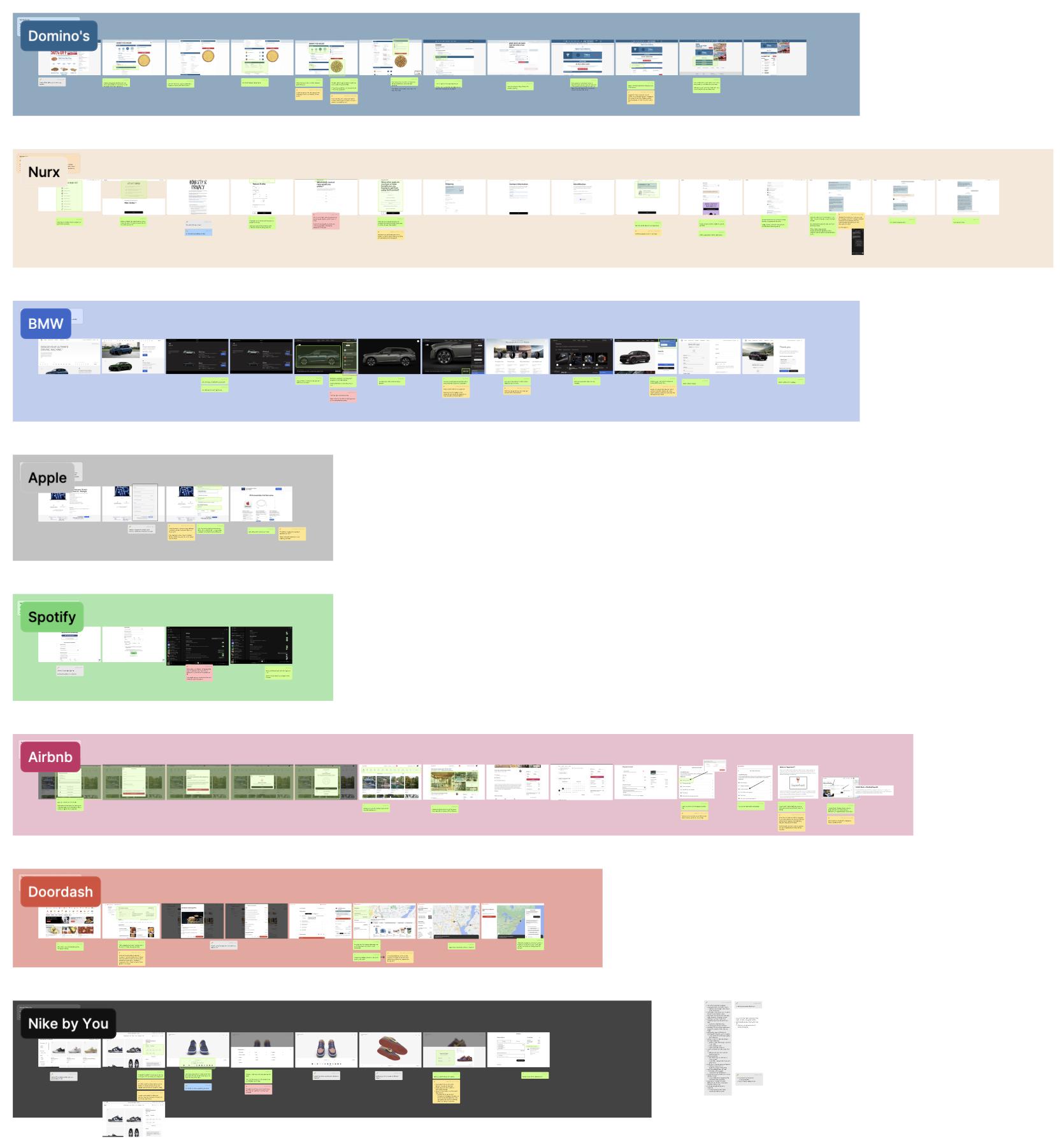
Cross-Industry Audit
Given the outdated nature of medical devices and software, I also audited products from other industries such as food delivery, automotive, fashion, and entertainment. This audit taught us the importance of progress tracking, model visualization, and simple information collection, which we aimed to incorporate into our platform.
.png)
Surgeon Personas
To tailor our solution to surgeons' needs, I suggested developing detailed personas. These personas helped us understand their specific needs, pain points, and goals, ensuring our design addressed the most critical aspects of their workflow.
.png)
Blue-Sky Brainstorming
I led a Crazy Eights rapid brainstorming and sketching session with design teammates across the organization. This exercise generated a wealth of innovative ideas that informed our concepting phase and helped us think beyond conventional solutions.
.png)
FRAMEWORKS
We aligned with the overall project team to prioritize features, create an information architecture, develop a spatial model, and design key screens to ensure clarity and focus.
Feature Prioritization & Key Moments

We prioritized features based on their importance to the surgeons' workflow and the feasibility within our sprint cycles. This process involved collaboration with business and development stakeholders to ensure alignment and practicality.
To communicate our vision effectively, I created low-fidelity screens for "key moments" that illustrated the main functionalities and user interactions. These screens served as a reference point for the team, providing a clear understanding of our design intentions.
Information Architecture
Creating a clear navigation structure and information architecture was crucial. We worked closely with business and development teams to gain alignment and ensure that the architecture was intuitive and scalable.

Spatial Model
We developed a spatial model to visualize the layout and interaction flow of the platform. This helped us ensure a cohesive and user-friendly design that could be easily understood by the development team.

DESIGN SYSTEM
We created a cohesive and scalable design system by auditing existing components, addressing UI inconsistencies, and establishing usage guidelines in alignment with the project team.
Understanding Atomic Design
I consulted with the designers responsible for the DePuy Synthes (DPS) Design System to understand the existing design standards in other projects with more established design systems. Our overall design group wanted to create a foundation based on atomic design, which I used as the framework to build my project's design system.
.png)
Initial Audit and Documenting Inconsistencies
With an understanding of design system expectations, the next step was to audit existing screens from the project. I noticed several inconsistencies which needed to be addressed to ensure a cohesive user experience.
I reviewed each screen meticulously, comparing them against the DPS design system guidelines and standards, and documented all inconsistencies in a detailed log. This log included screenshots of problematic areas, descriptions of the inconsistencies, and references to the relevant design guidelines. I then shared this inconsistency log with the design team and conducted collaborative review sessions to discuss the findings and align on the best approach to address them.
.png)
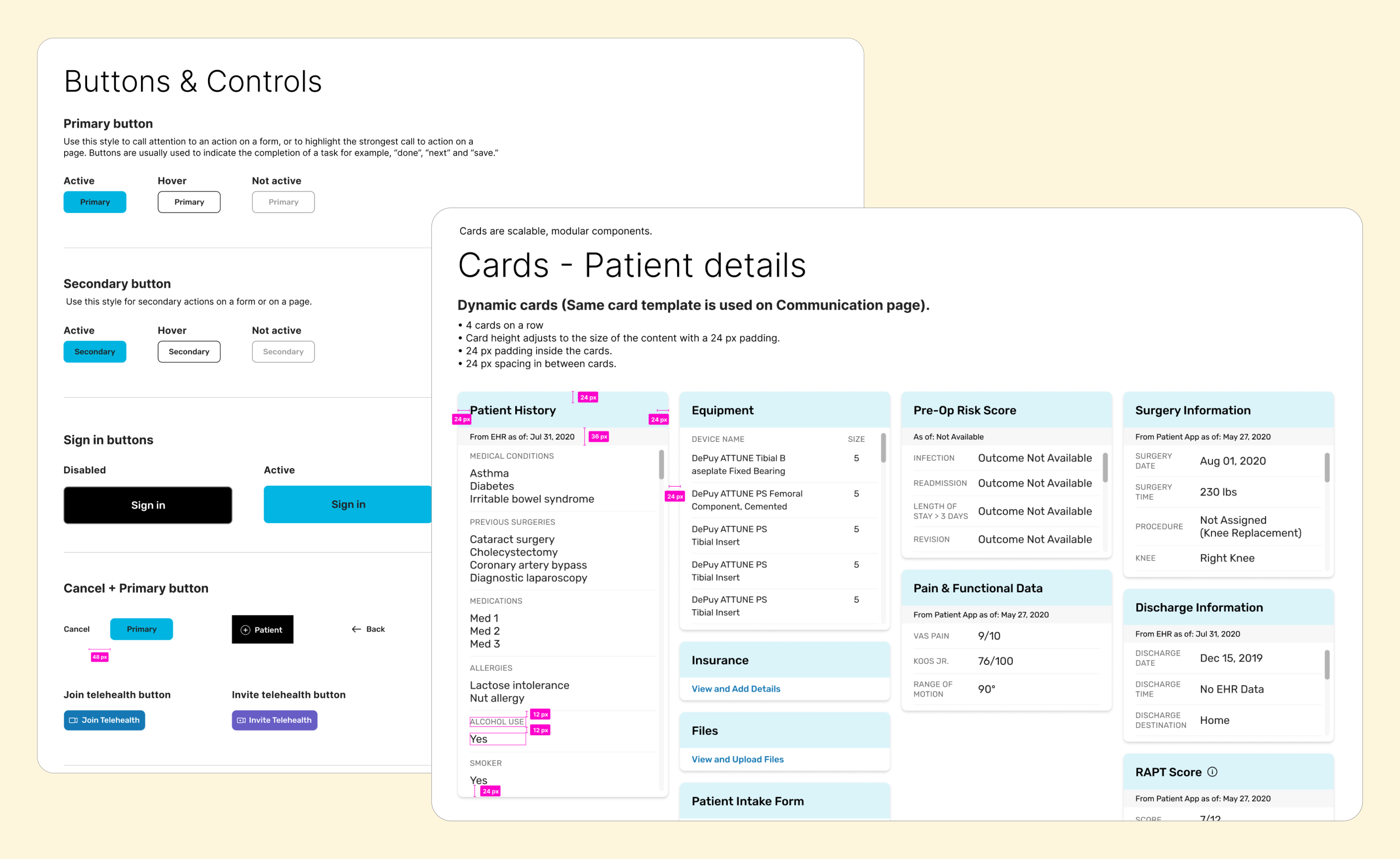
Creating the Design System
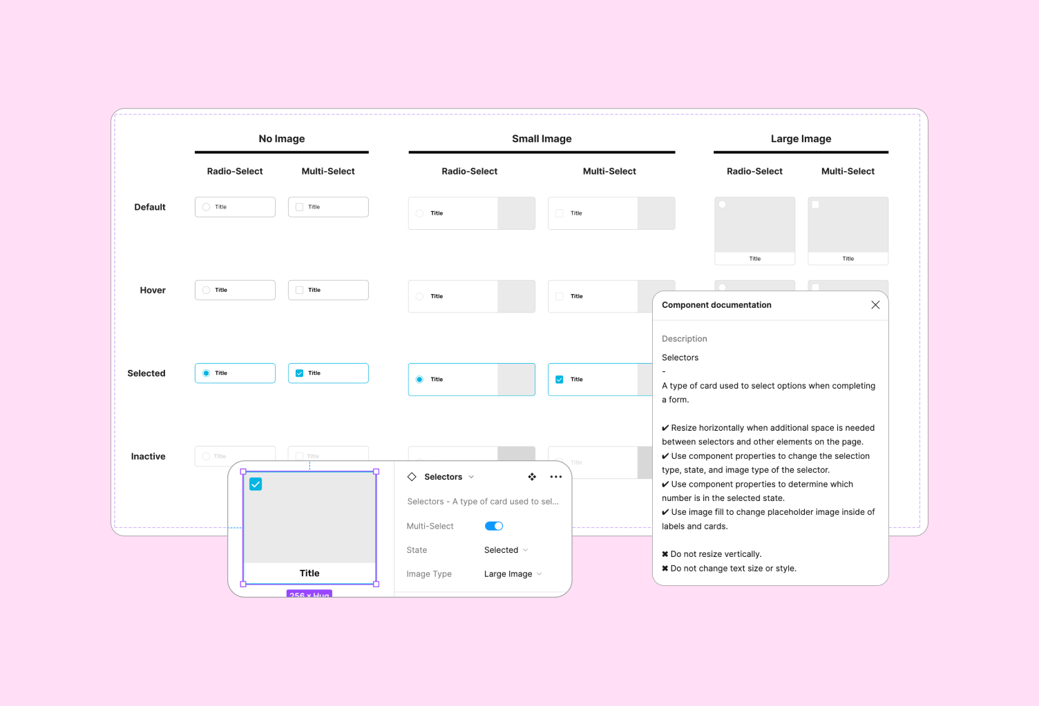
With a clear understanding of the inconsistencies and the DPS design standards, I proceeded to create a cohesive design system for our project. This involved integrating parts of the previous design toolkit and pre-built Appian (the low-code platform our developers were using) components to build the foundation of our design system. I adapted and converted some components from the Appian design system to align with our DPS design system, modifying colors, formats, drop shadows, and outlines to match the DPS toolkit. I also developed custom components (such as the selectors shown below), ensuring adaptability for both mobile and desktop modes using auto layout and variant properties.

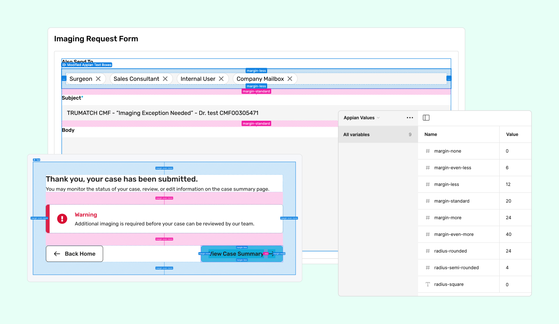
Appian's limited flexibility required us to use predefined variables for elements like border radii, padding, and margins. To bridge the gap between our Figma designs and Appian’s constraints, I built these predefined values into Figma. For example, Appian's border radii options included square (about 0px), semi-rounded (about 2px), and rounded (about 4px), while margins were defined as "more" (about 24px), "even more" (about 56px), and standard (about 20px). By incorporating these variables into our Figma designs, we ensured that developers could easily translate our exact pixel specifications into Appian’s predefined values, maintaining design consistency and reducing the need for guesswork.
Elevating Accessibility with Color Contrast
I already knew that the DPS design toolkit and the Appian component library, which I was basing my design system on, met Level AAA WCAG color contrast standards. This meant that the new components I was going to build would already be up to standard.
However, another significant aspect of the platform was the status tags, which indicate the current status of a case. I audited a total of 22 tags for color contrast to ensure they met accessibility requirements. After thorough testing and evaluation, I developed a list of new hex codes for the development team to implement, guaranteeing that all status tags are accessible and compliant with WCAG standards.
.png)
Establishing Usage Guidelines
We created detailed usage guidelines for designers and developers to ensure consistent application of components across the platform. These guidelines included instructions on adapting the design for different screen sizes and organizing components effectively.
FEATURE SPRINTS
We designed each feature from low to high fidelity under the fast pace of 3-week design sprints.
Low-Fidelity Brainstorming with Key Stakeholders
During each sprint, I started by leading sketching and brainstorming sessions, involving the design team and key stakeholders from the development and business teams. This collaborative approach ensured that our concepts were innovative yet feasible within the constraints of the software (Appian) and the overall project scope.
High-Fidelity, Participatory Design with Surgeons
Once we had high fidelity screens, we engaged in participatory design sessions with a team of surgeon partners. This iterative process allowed us to refine designs, address concerns, and incorporate concepts for future enhancements. To ensure productive conversations and that the surgeons felt heard, I annotated screens with design rationale for presentations and documented feedback live during design sessions.


HANDOFF
I led a design documentation workshop and share-out presentations at the end of each feature sprint to ensure seamless transitions from design to development.
Figma Documentation Workshop
I led a design documentation workshop with the development team to ensure that they understood how our documentation was organized. I did a live tutorial on Figma's developer mode and utilizing comments to communicate with our design team.
.png)
Full End-to-End Flow Share-Outs
I organized and presented full end-to-end flow share-outs with the entire team to get all feedback necessary to make any last refinements before developer handoff. This comprehensive review process ensured that all aspects of the user journey were thoroughly considered and optimized.
.png)
LEARNINGS
A robust design system is critical to creating a consistent user experience.
This project underscored the critical role of a robust design system in creating a scalable and user-centric platform. By closely aligning with the development team's agile framework, conducting thorough research, and meticulously developing a detailed design system, we successfully enhanced the surgeons' workflow. This case study demonstrates my ability to lead complex UX projects, ensuring a cohesive and efficient user experience from planning through to final implementation.
Collaboration is key to successful design.
Throughout this project, I learned the immense value of collaboration and the importance of involving all stakeholders in the design process. By engaging with development, product, and business stakeholders, as well as surgeon users, we were able to gather diverse perspectives that enriched our design solutions. This collaborative approach fostered a sense of shared ownership and ensured that all voices were heard and considered. By bringing everyone into the design process, we were able to create a more cohesive and well-rounded product that met the needs of all users.