The Better Lab & The Zuckerberg San Francisco General Hospital
Creating Change for Trauma Survivors
ROLE
SKILLS
TEAM
TIMELINE
CONTEXT
I worked with UCSF's The Better Lab to design WrapApp, enhancing communication between case managers and clients to prevent future violent injuries.
As an intern at The Better Lab, a healthcare design lab at UCSF, I collaborated with The Wraparound Project under the Zuckerberg San Francisco General Hospital to lead the user experience and interface design of the WrapApp, a mobile platform created to enhance communication and planning between case managers and clients to prevent the likelihood of future violent injury.
Throughout my time working on this project, I was lucky to gain experience in planning and analyzing qualitative interviews, competitive UX analysis, low-to-high fidelity prototyping, A/B Testing, and RITE Testing.
DISCOVERY
I led two affinity mapping and feature prioritization sessions to synthesize past interviews and define user needs for the homepage and resource page.
We utilized virtual post-it notes to capture key insights and user feedback from the interviews. This approach enabled the team to visually cluster similar themes and identify patterns, leading to a clearer understanding of user needs and preferences. The synthesized information provided a solid foundation for defining the feature's scope and aligning it with user expectations.


MARKET RESEARCH
I did a competitive analysis of productivity and wellness apps currently on the market to use for inspiration.
Conducting a competitive analysis of current productivity and wellness apps provided valuable inspiration for our homepage feature design. We examined popular applications to identify best practices and innovative solutions that enhance user engagement and satisfaction. This analysis highlighted effective design elements, user flow patterns, and feature sets that could be adapted and integrated into our homepage. The insights gained from this research informed our design decisions, ensuring that our homepage feature is competitive and aligned with user expectations.

LO-FI PROTOTYPES
I designed low-fidelity paper prototypes of new homepage feature for second-round user interviews.
To gather early feedback on our new homepage feature, we developed low-fidelity paper prototypes for use in second-round user interviews. These prototypes were simple sketches that illustrated the basic layout and functionality of the proposed feature. By presenting these prototypes to users, we were able to quickly and cost-effectively test concepts, gather feedback, and identify areas for improvement. This iterative approach allowed us to refine the design based on real user input before investing in higher-fidelity prototypes.

A/B TESTING
We conducted A/B testing to understand the best way to display progress for users.
To determine the most effective way to display progress on the homepage, we conducted A/B testing of different visualization options. By presenting users with two versions of the progress visualization, we were able to compare their preferences and interactions. Metrics such as engagement rate, task completion time, and user satisfaction were analyzed to identify the superior design. The results of the A/B test provided data-driven insights that guided our decision on which progress visualization to implement.

RITE Testing
We used a Google Sheets tracker following Rapid Iterative Testing and Evaluation (RITE) testing method for second round interviews.
We utilized a Google Sheets tracker to manage and document the Rapid Iterative Testing and Evaluation (RITE) method during our second-round interviews. This tracker allowed us to systematically record user feedback, identify issues, and track design changes across iterations. By organizing data in a structured format, we ensured that all team members could easily access and update the information. The use of a Google Sheets tracker facilitated efficient communication and coordination, streamlining the iterative testing process.

SYNTHESIS
We used a synthesis board to compile and analyze findings from second round qualitative interviews.
This board served as a visual tool to consolidate user feedback, highlight recurring themes, and identify actionable insights. By organizing interview notes and observations into categories, we were able to draw meaningful connections and prioritize design adjustments. The synthesis board played a crucial role in distilling complex data into clear, actionable steps for the design team.

HI-FI PROTOTYPES
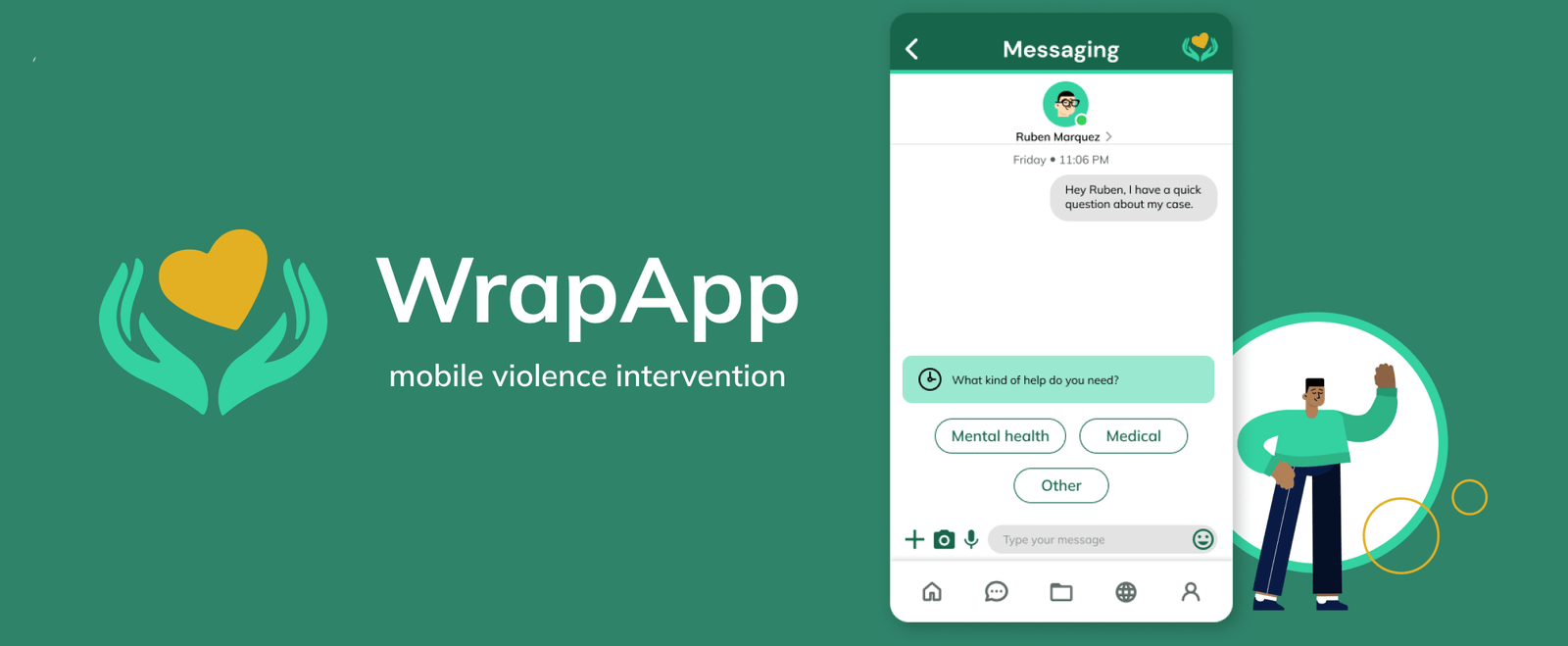
After rounds of research and testing, I designed full high-fidelity flows for 3 different features.
The flow shown below is of our messaging feature, for which I designed a new out-of-office alert flow. This flow ensures that users are promptly informed when a recipient is unavailable, providing alternative contact options or expected return times. The design process involved mapping out user journeys, creating wireframes, and validating the flow through user testing. By implementing this alert system, we aim to improve communication efficiency and user satisfaction, reducing potential frustration caused by delayed responses.
